Pantone’s ‘Colour of the Year’ for 2022 would have made Prince blush

For over 20 years, Pantone’s ‘Colour of the Year’ has influenced product development and purchasing decisions across various industries, namely fashion, home furnishings, industrial design and auto manufacturing, as well as product packaging and graphic design.
This year, the world’s most renowned colour specialists have opted for a rather royal-looking hue.
Given the name ‘Very Peri’, it’s a kind of soft purple or, according to Pantone, “a combination of blue and reddish violet”.
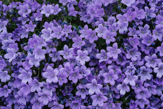
According to the aesthetic specialists, Very Peri is a shade that has never existed before. Certainly that daft name has never existed before. Whoever came up with it obviously hasn’t been to a Nando’s, where the colour of Peri Peri sauce is more of a brownish orange.
“The energy of the mixture of these two colours represents transformation,” reads a Pantone press release, “which is completely appropriate to the phase the world is facing; a phase in which the pandemic has caused our daily lives to suffer many changes.”

“It is very important to convey the message of change, of transformation in this day and age. Society recognises colours as a form of communication and expression, and Very Peri highlights the expansive possibilities that lie before us.
You can expect to see a lot of Very Peri, and variations of it, in fashion boutiques and furniture showrooms, as well as in hairdressing and interior design, and even in cooking (wait for the MasterChef ‘Colour Purple’ Special, or something daft like that).
I might consider painting a feature wall in my living room Very Peri. Only to deter my eyes from the crap I’m subjected to on commercial TV.

To professional graphic designers, if you’re searching for Very Peri on the Pantone colour wheel, simply key in the serial number 17-3938 TCX.
Funnily enough, Cream’s retail offshoot The Pop Shop has been using its own version of Very Peri in its marketing for the past year, albeit a somewhat darker hue. Ahead of our time? Well, yes. And we’ll be sticking to this colour… for most of this year, anyway.
Antonino Tati


Discover more from
Subscribe to get the latest posts sent to your email.

Leave a Reply