Apple hypes up its ‘new’ home screen pages but really it’s just more chaos and crap for your phone
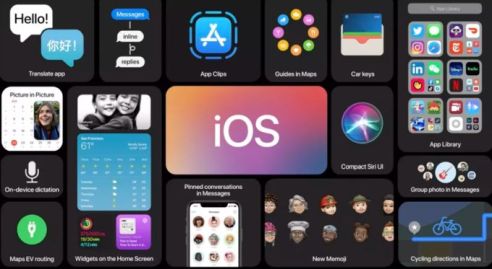
Apple today previewed iOS 14, the “biggest” update to its home screen pages with redesigned widgets and an app library for idiots who don’t know how to order their apps A-Z or in order of popular use.
They have done this to supposedly make app-searching an easier task but instead it makes your home screen look like a mess.
Strange for a brand whose phones are too minimalist for their own good (where the fuck is that on and off button we wonder as we scrummage through our bags at night).
Apps and info can be pinned in different sizes on any home screen page so that now each page can look like a three-year-old’s scrapbook of crap art.
Users can create a “smart stack” of widgets, which adopts “on-device intelligence” to surface the right widget based on time, location, and activity… so that when you’re not looking for a particular thing to do, it pops up in your face and when you are, well yes, it pops up in your face, too.
At the end of the home screen pages is the app library, a space that automatically organises all of the user’s apps into one view, and “intelligently” surfaces apps that may be helpful in the moment. Or that might be totally useless to you, depending on how good the phone’s algorithms are at any given moment.
Apple: the brand that keeps on changing its look and functionality to suit idiots who like to pay thousands of dollars for a phone that’s pretty much the same as it was six years ago, only with added hype and information overload.
Michael Mastess
Discover more from
Subscribe to get the latest posts sent to your email.

Leave a Reply